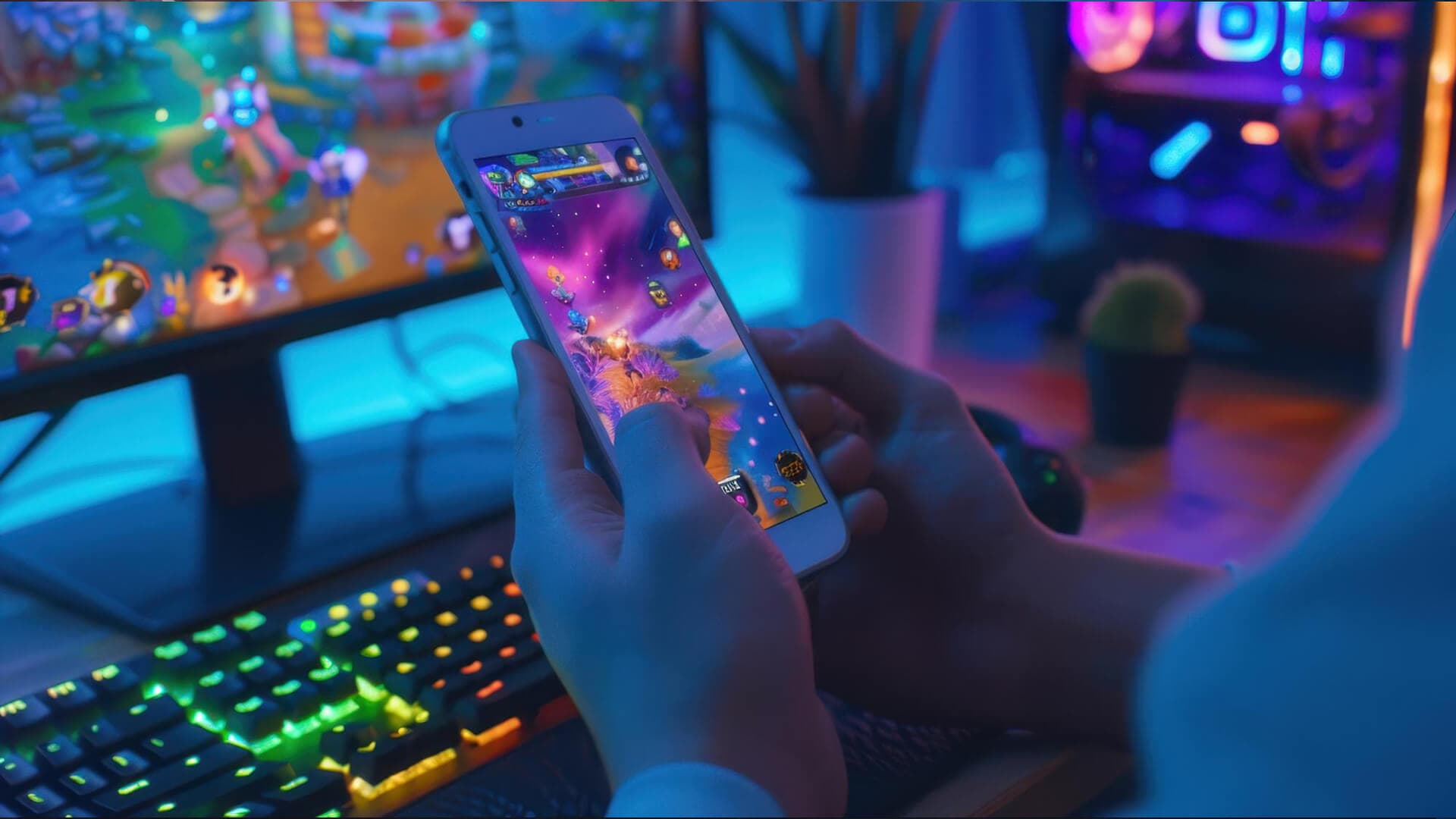
The Day a Game Lost 60% of Its Players Overnight
In early 2025, the team behind a top-50 grossing mobile puzzle game made a routine update. They softened the color palette, stripped out a handful of animations to improve performance, and flattened the UI into something more minimal.
Within 48 hours, daily active users fell by 60%. Day-1 retention dropped from 45% to 22%. Revenue followed.
The cause was not a bug. The gameplay had not changed at all. What changed was how the game felt. Players lost the visual feedback and emotional energy that had kept them returning daily. When the team reverted the changes, users came back. Retention and revenue recovered within a week.
That incident captures something every mobile studio eventually learns: mobile game engagement is not purely a mechanics problem. It is a sensory problem. And among all the design tools available, color and animation are the two most powerful levers you have.
The Psychology of Color in Mobile Games
The human brain processes color before it registers words or shapes. In a medium where you have seconds to hold a player’s attention, color is not decoration: it is communication.
What Different Colors Signal to Players
Each color carries psychological weight that players respond to without realizing it. Red signals urgency and energy, which is why it works well for action buttons, power-ups, and danger indicators. Blue conveys calm and focus, making it a natural fit for puzzle games and strategy interfaces. Yellow and orange are linked to optimism and reward, appearing prominently in achievement screens, loot drops, and sale banners. Purple is associated with rarity and prestige, which is why premium items across games like Clash Royale use it to communicate value. Green signals safety and growth, making it effective for healing mechanics and progress indicators.
This is not arbitrary. Studies in color psychology consistently show that color affects snap judgments, brand recall, and purchase behavior. For game designers, this means every color choice either reinforces your intended experience or works against it.
Three Color Strategies That Improve Retention
Contrast and clarity for interactive elements.
If a player cannot immediately identify what is tappable, they will tap nothing. High-contrast buttons on dark backgrounds outperform low-contrast ones significantly in click-through tests. The “Play” button should never require a second look.
Emotional anchoring through consistency.
Assign a specific color to a specific feeling and stick to it throughout the game. Angry Birds uses red for the birds (aggression) and green for the pigs (the enemy, but calm). Candy Crush’s saturated palette maintains constant stimulation. When color meanings are consistent, players build intuition faster and feel more in control, which directly improves retention.
Visual progression through color.
Players need to feel they are moving forward. Using color to signal progression; grey items becoming blue, then gold, then legendary rewards the eye before the stats screen does. Clash Royale’s chest system is a clean example: Silver, Gold, Giant, Magical, and Legendary chests each have a visually distinct color that communicates value instantly.
Common Color Mistakes That Hurt Performance
Ignoring color vision deficiency.
Around 8% of men and 0.5% of women have some form of color blindness. If your game communicates critical information through color alone, a significant portion of your audience cannot play it properly. The fix is simple: pair color with shape, icon, or label. Adobe Color includes a color blindness simulator for exactly this purpose.
Using too many colors.
A palette without discipline creates visual noise. A useful rule of thumb is the 60-30-10 structure: 60% dominant color, 30% secondary, 10% accent. Test your UI in grayscale. If the hierarchy still reads clearly, your contrast ratios are working.
Not testing across devices.
Colors that look vivid on an iPhone OLED screen can appear washed out on a mid-range Android LCD. Use the sRGB color space as your baseline, and always test on at least three device types before shipping a visual update.
How Animation Drives Mobile Game Engagement
If color is what draws players in, animation is what keeps them there. Movement communicates, builds emotion, and makes a game world feel inhabited. Without it, even a well-designed game can feel inert.
The Four Animation Types That Matter Most
1. Feedback animations confirm that player input registered. When a candy bursts, a card slams onto the board, or a fruit splits open, the player receives instant sensory confirmation that their action had an effect. Games without this feedback feel unresponsive, and unresponsive games get deleted. This is one of the highest-leverage areas for improving mobile game engagement because it directly affects how satisfying the core loop feels.
2. UI animations reduce cognitive load by telling players where to look next. A pulsing button draws the eye without a tutorial. A bouncing resource counter communicates “something needs your attention” without text. These micro-level guidance animations are especially important during onboarding, where confusion leads to early churn.
3. Character and object animations build emotional attachment. Idle animations, in particular, make the world feel alive even when the player is doing nothing. The Angry Birds waiting to be launched, the Among Us crewmates bobbing while standing still, the Roblox avatar waving, these small loops create personality and make players feel invested in characters rather than just using them as tools.
4. Transition animations maintain immersion between states. A jarring cut between a level clear screen and the next level breaks the experience. Smooth fades, zooms, and reveals keep the player inside the world. This matters more than many studios realize: session length correlates with how uninterrupted the experience feels.
Core Animation Principles for Mobile Games
Disney’s 12 Principles of Animation were developed for film, but they apply directly to game UI and character animation. The most relevant for mobile game engagement are:
Squash and stretch gives buttons and characters physical weight. Anticipation prepares the player for what is about to happen, which builds tension in a way that static images cannot. Slow in and slow out (easing) makes movements feel natural rather than robotic. Exaggeration amplifies emotional impact — a “juicy” explosion communicates more satisfaction than a realistic one.
“Juiciness” is a term used in game design to describe the cumulative effect of layered, exaggerated feedback: screen shake, particle bursts, sound-synced animations. It triggers a dopamine response and is the primary reason players describe certain games as “addictive” without being able to articulate why. Fruit Ninja, Candy Crush, and Brawl Stars all rely heavily on juicy feedback.
Animation Mistakes That Hurt Performance
Over-animating.
More animation is not always better. Too many simultaneous effects slow down older devices, drain the battery, and visually overwhelm players. Prioritize feedback and UI animations. Use level-of-detail (LOD) settings to reduce complexity on lower-end hardware.
Ignoring device range.
Your game needs to run smoothly on hardware from several years ago. Test on a device at or below your minimum spec. If animations drop frames there, players on those devices will churn before they ever engage with your core loop.
Breaking screen-size consistency.
Animations that look polished on a tablet can clip, scale oddly, or feel jarring on a small phone screen. Use relative positioning and test across your full range of supported screen sizes before each build.
How Color and Animation Work Together
Color and animation are most effective when they reinforce each other rather than operating independently.
A pulsing red button communicates urgency more effectively than a static red button or a pulsing grey one. The color sets the emotional tone; the animation amplifies it. This combination is the basis of what designers call the “attention magnet,” a bright, moving element that the eye cannot ignore.
Feedback loops benefit from this pairing, too. Green confetti for a win, red screen shake for a loss: the color delivers the meaning and the animation confirms the event happened. Players read these signals instantly, which reduces cognitive friction and makes the experience feel intuitive rather than learned.
Games that align color and animation with their emotional core, where every visual element supports the intended feeling rather than contradicting it, consistently outperform games where these choices were made independently or without a unifying system. This is one of the most practical ways to improve mobile game engagement without changing a single line of gameplay code.
Real-World Examples Worth Studying
Candy Crush Saga built its retention around feedback animation. Saturated, distinct candy colors plus explosive match animations create a sensory loop that is hard to interrupt. The game’s Day-1 retention has historically outperformed the industry average by a wide margin, and color plus animation is a core reason.
Clash Royale uses color coding to communicate card identity at a glance (red for fire, blue for water, green for nature) while dramatic spell animations create emotional peaks during matches. The combination builds both comprehension and emotional investment, which is part of why its seven-day retention is exceptional for a competitive mobile game.
Monument Valley demonstrates that subtlety works too. Smooth platform transitions, gentle lighting shifts, and the absence of UI clutter create a meditative experience that players still recommend and return to years after launch. Animation and color do not need to be loud to be effective.
Pokemon GO applied color and AR animation to create something players experience as genuinely magical. Pikachu’s yellow, Charizard’s orange, the “pop” of a Pokeball in AR space, the visual language is consistent, vivid, and emotional in a way that keeps players returning long after the novelty of the AR format fades.
How to Implement These Strategies in Your Game
Start with your game’s emotional core before touching any tools. The question to answer first is: what should players feel? Excitement requires different color and animation choices than relaxation or competition. Once that is defined, every visual decision has a reference point.
From there, choose a limited palette of three to five primary colors plus neutrals. Use free tools like Adobe Color, Coolors, or Paletton. Run your palette through a contrast checker (WebAIM is free) and a color blindness simulator before finalizing anything.
For animation, start with feedback. Button presses, swipes, and match confirmations should be your first implementations. Add easing curves to everything; linear movement reads as unnatural. Layer in idle animations for characters after your core feedback system is working.
Test on real devices throughout not just in an emulator. Use Unity Profiler or your engine’s equivalent to catch frame rate issues before they reach players. A/B test color and animation changes with actual user segments when possible; player behavior data will tell you more than internal feedback.
Final Thoughts
Mobile game engagement is built in the spaces players do not consciously notice. It is the satisfying pop of a matched tile, the red glow of a limited-time offer, the idle sway of a character waiting to be played. These are not polish items to add after the game is finished. They are the mechanics of feeling and feeling is what keeps players coming back.
Start with your emotional core. Choose colors that serve it. Build animations that reinforce it. Test relentlessly, and let player behavior guide your iterations.
If you are working through engagement or retention problems and need a team with direct experience in this area, Trifleck offers mobile game development and optimization services that address exactly these challenges.
Frequently Asked Questions
What is mobile game engagement and why does it matter?
Mobile game engagement refers to how actively and consistently players interact with a game, measured through metrics like daily active users, session length, Day-1 retention, and Day-7 retention. High engagement means players return regularly, spend more time in-session, and are more likely to make in-app purchases. It is the primary indicator of a game’s long-term viability.
How does color psychology affect player retention in mobile games?
Color influences emotion and decision-making before players consciously process what they are seeing. When color choices align with the intended emotional experience of a game, players feel more connected to it. Consistent color coding also reduces cognitive load, making games easier to learn and more satisfying to play, both of which improve retention.
What types of animations improve mobile game engagement most?
Feedback animations have the highest direct impact because they make the core loop feel satisfying and responsive. UI animations reduce confusion and guide players through onboarding. Together, these two animation types address the most common early-exit points in a player’s first session.
How many colors should a mobile game use?
Most successful mobile games use three to five primary colors plus neutrals like black, white, and grey. A 60-30-10 split (dominant, secondary, accent) provides visual structure without creating noise. Simpler palettes also tend to perform better on smaller screens where too many competing colors create confusion.
What is “juiciness” in mobile game animation?
Juiciness is a design term for the layered, exaggerated visual and audio feedback that makes player actions feel impactful. It typically involves combinations of screen shake, particle effects, sound synchronization, and exaggerated motion. Games with high juiciness are often described as “satisfying” or “addictive” because the feedback loop reinforces the desire to repeat actions.
Can small studios improve mobile game engagement without a large art budget?
Yes. The highest-impact improvements, feedback animations and high-contrast color choices, are low-cost to implement. Starting with button press feedback, consistent color coding for UI states, and simple particle effects on key interactions will produce measurable improvements in session length and retention without requiring a large animation team.
How do I test whether my color and animation choices are working?
Track retention rate, session length, and tutorial completion rate before and after changes. A/B testing color schemes and animation variations within your player base gives you real behavioral data. User testing sessions, where you watch players interact with the game live, will surface friction points that analytics alone cannot identify.