Liquid Glass UI is one of those styles that looks simple until you try to build it. In a design mockup, it feels effortless: soft blur, gentle tint, depth that makes cards float, and motion that feels “expensive” without being loud. In a real React Native app, it can quickly turn into stutters, unreadable text, and a UI that looks different on every device.
This guide is built for the real world. It explains Liquid Glass, shows how to implement it in React Native with code, and shares practical ways to keep it smooth, accessible, and consistent across iOS and Android.
If you’re building an app and you want the “premium” feel without sacrificing usability, Liquid Glass can work beautifully. And if you’re planning the full build, Trifleck’s mobile app development services cover the full scope, from UI direction and component systems to performance tuning and release-ready implementation.
Liquid Glass In 2026: What It Is and What It Is Not
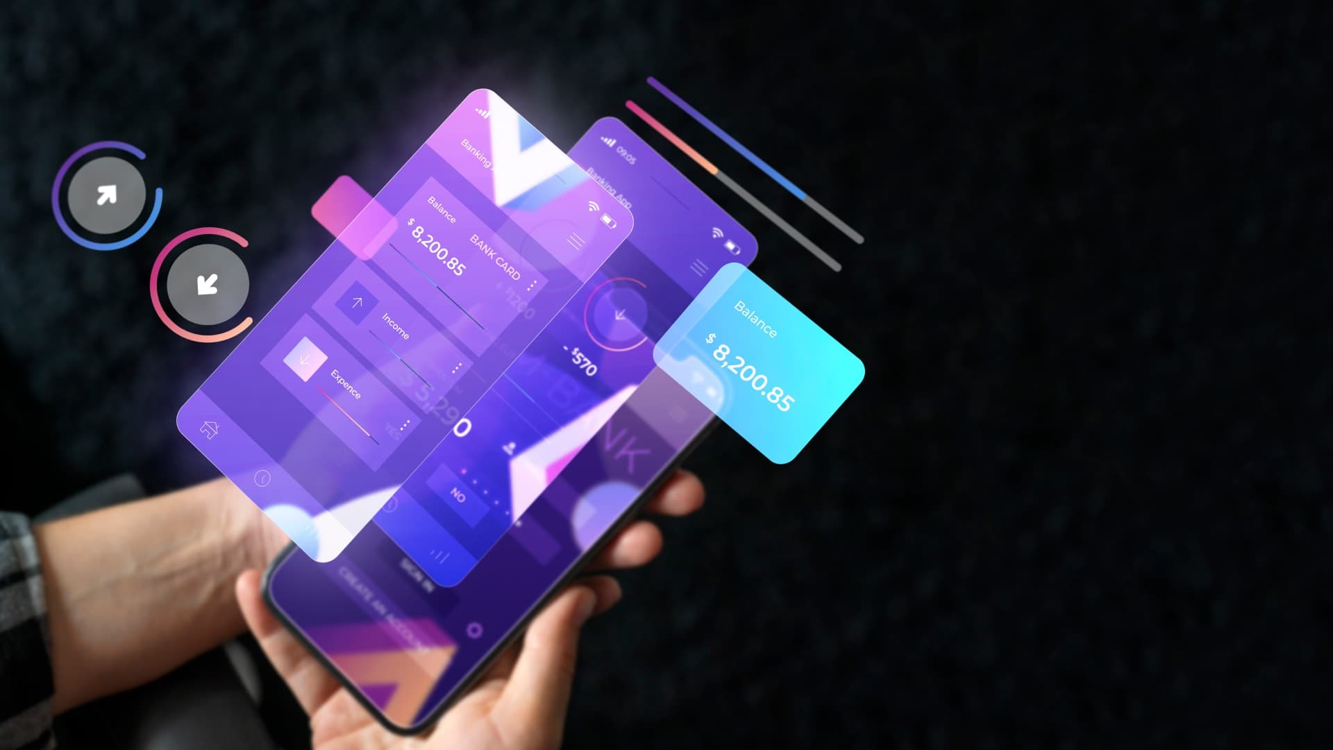
Liquid Glass is a UI style where parts of your interface behave like translucent material layered above the background. The goal is depth and softness, not distraction. It usually combines blur, tint, gentle borders, and motion that makes the layer feel alive instead of static.
What makes it different from the older “glassmorphism” trend is how it’s used:
- Glassmorphism often looked like frosted panels pasted on top of colorful gradients.
- Liquid Glass leans into realism and motion. The blur feels more intentional, the depth is clearer, and the UI behaves more like a material than a sticker.
The building blocks of Liquid Glass
Most Liquid Glass components are built from the same small set of ingredients:
- Blur: makes the background feel diffused behind the card.
- Tint: keeps the blur readable and on-brand.
- Border or highlight: adds a subtle edge, so the glass doesn’t disappear.
- Depth: shadow or elevation, used carefully.
- Motion: small, controlled animation that gives the surface “life.”
Here’s a simple reference table teams use when translating “Liquid Glass” into actual component decisions:
| Element | What it does | Common mistake | Better approach |
| Blur | Softens background behind surface | Too many blur layers | Use blur for key surfaces only |
| Tint | Maintains readability and brand tone | Tint too weak, text becomes unreadable | Slight tint plus text overlay rules |
| Border/highlight | Defines edges and separation | Thick borders look cheap | Thin, low-opacity border |
| Depth | Creates layering and hierarchy | Heavy shadows feel fake | Subtle depth, consistent across app |
| Motion | Makes glass feel responsive | Over-animating everything | Micro-interactions only |
When Liquid Glass Is A Good Idea, and When It Is Not
Liquid Glass is not a “use everywhere” style. It works best when it supports clarity.
Great use cases
- Dashboard cards and panels
- Toolbars and bottom sheets
- Modals and overlays
- Settings panels and small “focus areas”
- Premium onboarding screens that need depth and calm
Risky use cases
- Dense text screens where contrast must stay strong
- Interfaces with busy photo backgrounds
- Low-end device targets where performance margin is tight
- Apps that require extremely strict accessibility contrast at all times
A practical rule: if the glass surface is not helping the user focus, it probably shouldn’t be glass.
Before getting into the build steps, it helps to check the budget side for a second. Liquid Glass can be simple when it’s used for a few cards, but it can also add effort if the app needs a full glass design system, smooth animations, and performance fallbacks for different devices. If you’re planning an app and want a quick estimate, use Trifleck’s app development cost calculator and get a rough cost range based on your platform and features.
Calculate your app cost here: https://www.trifleck.com/app-cost-calculator
Budget and Build Reality Check Before You Commit
Liquid Glass can be quick to prototype but time-consuming to productionize. That’s because it touches multiple parts of the app: UI components, performance, animation, and accessibility.
If you’re scoping an app build and want a realistic estimate, use Trifleck’s app development cost calculator early, before the design system gets locked. It’s a simple way to align budget with UI complexity and avoid surprises later.
This is also where mobile app development services matter. Liquid Glass looks premium only when it’s implemented with discipline, and that requires experience with device testing, component architecture, and performance profiling.
Choosing The Right Blur Approach In React Native
React Native gives you multiple routes to blur. The “right” choice depends on your setup and how “real” you want the glass to look.
Option A: Expo projects with expo-blur
If you’re on Expo, expo-blur is the easiest starting point. The API is straightforward, and it’s perfect for prototypes and production in many cases.
Option B: Bare React Native with native blur libraries
If you’re not on Expo, you’ll likely use a native blur implementation (varies by library). These can offer better control or performance depending on your needs.
Option C: Skia for advanced and custom effects
If your app needs more realistic liquid behavior, custom shaders, or ultra-smooth performance with advanced visuals, Skia can be a strong option. It also increases complexity, so teams should choose it only when the payoff is real.
Here’s a quick comparison table for a 2026 decision mindset:
| Approach | Best for | Tradeoff | Team fit |
| expo-blur | Fast implementation and solid results | Less customization | Great for most apps |
| Native blur lib | Cross-platform control in bare RN | Setup differences, more maintenance | Good for mature RN teams |
| Skia | High-end, custom visual effects | Higher complexity and bundle cost | Best for premium UI teams |
Step-By-Step: Build A GlassCard Component (Clean, Reusable, Readable)
The mistake many teams make is scattering BlurViews everywhere. Liquid Glass should be a system, not a bunch of one-off effects.
Start with one reusable component, then build variants.
Step 1: Install blur (Expo example)
npm install expo-blur
Step 2: Create a “GlassCard” with safe defaults
Step 3: Use it in a real screen
A Liquid Glass card feels premium when it’s paired with restraint: clean spacing, readable typography, and consistent component rules.
Make It Feel “Liquid” With Motion
Liquid Glass often looks best when it reacts slightly to interaction. Not bouncing everywhere. Just subtle feedback.
The simplest approach is a gentle press animation: slightly higher opacity, a tiny scale shift, and a clean spring back.
React Native Reanimated example:
Small note: keep motion subtle. If the UI constantly moves, it stops feeling premium and starts feeling busy.
Performance: How To Keep Liquid Glass Smooth On Real Phones
This is where many “looks great on simulator” designs fall apart.
The three most common performance killers
- Too many blur layers on one screen
- Blur re-rendering constantly during animations and scrolling
- Heavy overlays stacked with transparency and shadow
A practical optimization table teams actually use
| Optimization | What it fixes | What to watch |
| Keep blur surfaces to 1–2 key areas | GPU load and stutter | Use solid surfaces elsewhere |
| Reduce blur intensity on low-end devices | Frame drops | Maintain a consistent tint so it still looks intentional |
| Avoid animating blur itself | Constant re-render cost | Animate the container, not the blur calculation |
| Use stable backgrounds behind blur | Visual flicker | Avoid noisy backgrounds under key text |
| Prefer one blur overlay for modals | Overdraw | Put content above it, not stacked blur views |
Adaptive intensity example (simple and effective)
You don’t need complicated detection logic to start. Even small adjustments help.
When Trifleck builds this kind of UI under mobile app development services, profiling is treated as part of the UI work, not an afterthought. That’s how you avoid shipping a pretty UI that feels laggy.
Accessibility and Readability Rules That Stop Liquid Glass From Failing
Liquid Glass can look beautiful and still be unusable. The big risk is readability, especially when backgrounds change.
Keep these rules consistent
- Text must stay readable regardless of background
- Important buttons must not disappear into blur
- Contrast should not depend on a background image behaving nicely
Here’s a lightweight checklist table you can apply to every glass component:
| Check | What to do | Quick fix if it fails |
| Text contrast | Test on light and dark backgrounds | Increase tint opacity behind text |
| Reduce transparency support | Offer fallback surface | Use solid translucent card color |
| Reduce motion support | Avoid constant animation | Keep micro-interactions optional |
| Tap targets | Ensure spacing and size | Increase padding inside glass cards |
A simple fallback style (when blur is reduced or disabled) can save you:
Design System Integration: Make Liquid Glass Consistent, Not Random
The fastest way to make Liquid Glass look cheap is letting every screen pick different blur, radius, border, and tint. Users feel inconsistency even if they can’t name it.
Create tokens (even if the app is small)
If your team uses a design token approach, Liquid Glass becomes much easier to scale.
Here’s a simple token example that works for both design and engineering conversations:
Define variants instead of endless customization
Keep it to 3 variants:
- Frosted card
- Dark overlay panel
- High-focus modal
That’s usually enough for a full product.
This is also where UI UX design services become valuable. A good Liquid Glass system is not only code, it’s consistent rules that designers and developers follow together.
Library And Approach Recommendations For 2026 Builds
Instead of chasing the “perfect” library, choose based on product goals.
If the goal is speed and stability
Use Expo blur, keep blur layers limited, focus on clarity. Most apps get premium results without going deep.
If the goal is a polished cross-platform look
Choose a blur approach that behaves consistently on iOS and Android, then enforce design tokens so the style is uniform. This aligns well with cross-platform app development when the product needs one design language across platforms.
If the goal is advanced visuals for a flagship product
Use Skia or advanced rendering only when the product truly benefits from it. Otherwise, complexity grows faster than the value.
If Liquid Glass is part of a new app build, it usually needs more than a nice card component. It needs: consistent UI rules, real-device testing, performance tuning, and production-ready implementation across iOS and Android.
That is exactly where Trifleck’s mobile app development services can help, whether the build is React Native, native iOS app development, or a mix of platforms. And if the project also needs brand identity assets, illustrations, or supporting visual collateral, there are professionals who can support those creative layers alongside the product build without complicating the development workflow.
A Practical Rollout Plan For Teams Building Liquid Glass
A smart way to implement Liquid Glass is to avoid rolling it out everywhere at once. Start small, then expand once performance and readability are proven.
Recommended rollout
- Build one reusable GlassCard component.
- Use it in 1–2 screens only.
- Profile performance on a mid-range Android device.
- Add accessibility fallbacks.
- Convert glass rules into tokens and variants.
- Expand the system to the rest of the UI.
This approach keeps quality high and reduces rework.
Common Mistakes To Avoid
A few mistakes show up again and again:
- Using blur on every card because it looks cool at first
- Forgetting how unreadable text can become on real content backgrounds
- Animating blur layers instead of animating container elements
- Mixing different glass “styles” across screens with no token rules
- Testing only on one iPhone and assuming it will be fine everywhere
Liquid Glass is not hard, it just punishes inconsistency.
Final Thoughts
Liquid Glass UI can be a great choice in 2026 because it helps apps feel calm, modern, and premium. But it only works when it’s treated like a system: consistent blur rules, readable contrast, careful motion, and performance-first implementation.
If your product needs a React Native build that looks premium and stays smooth across devices, Trifleck’s mobile app development services can help implement Liquid Glass the right way, with a reusable component approach, accessibility fallbacks, and real-world performance testing. Pair that with strong UI UX design services, and Liquid Glass becomes more than a trend. It becomes part of a clean design language users actually enjoy.