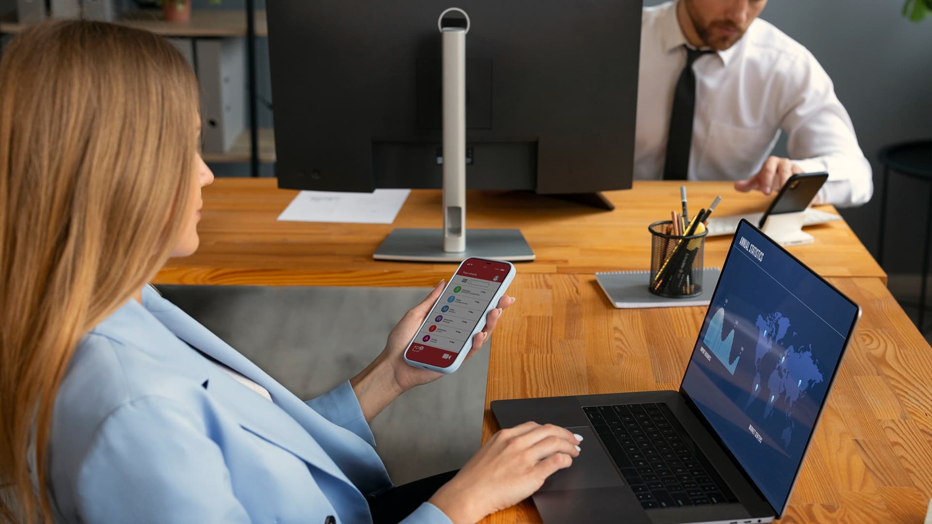
You have probably seen an upsell without realizing it.
You add something to your cart, then a small box pops up: “Upgrade to the bundle and save 15%.” Or you finish checkout and immediately get a one-click offer: “Add the matching charger for $9.” In SaaS, you hit a limit and the product calmly suggests the next plan or an add-on.
That is the practical idea behind an automated upsell system: show the right upgrade at the right moment, without a human manually chasing every customer.
When it is done well, it feels helpful, not pushy. It increases revenue per customer and can even reduce churn because people end up on plans that fit them better. When it is done badly, it annoys users, hurts trust, and can lower conversions.
This guide explains how it works for both ecommerce and SaaS.
What An Automated Upsell System Actually Is
At its core, an automated upsell system is a set of rules (or algorithms) that decides:
- Who should see an offer
- What offer they should see
- When they should see it
- Where it should show up (website, email, in-app, etc.)
“Automation” does not always mean complicated AI. Plenty of strong systems run on simple logic like “If cart value is above X, show bundle offer Y.”
Upsell, cross-sell, and “upgrade” are not the same thing
People mix these terms, so here is the simple distinction:
- Upsell: move someone to a higher version of the same thing (bigger plan, premium tier, higher-end model).
- Cross-sell: add something related (case for the phone, extra user seats, onboarding support).
- Upgrade: often used as a friendly word for upsell, especially in SaaS.
Most businesses use a mix. The “system” part is what prevents random offers and makes it consistent.
Why businesses build this in the first place
Because it is cheaper to earn more from an existing customer than to always chase a new one.
A good automated upsell system can:
- Increase average order value in ecommerce
- Increase expansion revenue in SaaS (seats, add-ons, plan upgrades)
- Create better customer fit (people get the features or products they actually need)
The key is matching offers to intent, not blasting everyone with the same pop-up.
Where Upsells Show Up In The Customer Journey
Different moments work for different offers. A post-purchase offer can succeed in ecommerce because the payment is already done. In SaaS, an in-product upgrade prompt often works best when the user is actively feeling a limitation.
Here is a quick map.
| Moment | Ecommerce example | SaaS example | What works best |
| Product page | “Upgrade to the bundle” | “Try Pro features” | Bundles, premium versions |
| Cart | “Add 2-year warranty” | “Add priority support” | Add-ons that reduce risk |
| Checkout | “Free shipping unlocked at $X” | “Annual plan saves 20%” | Simple, low-friction nudges |
| Post-purchase | “One-click accessory offer” | “Add 5 more seats” | Fast add-ons, upgrades |
| In-product usage | Not common | “You reached your limit” | Plan upgrades tied to value |
| Renewal/reactivation | “Subscribe and save” | “Switch to annual” | Long-term plans, retention offers |
If you only take one thing from the table, take this: the best upsells usually arrive when the customer already has momentum.
The Building Blocks Behind The Scenes
A lot of brands think an upsell system is “just a plugin.” Tools help, but the outcome depends on your setup. Most systems are made of four parts.
1) Signals (data you already have)
Signals are the clues that tell you what someone might want next.
Common signals:
- Items viewed, added to cart, removed from cart
- Past purchases
- Plan type, usage level, feature clicks (saas)
- Time on site, pages visited, returning visitor
- Region, device type, traffic source
You do not need perfect data. You need enough to avoid showing nonsense offers.
2) Segments (small groups that behave similarly)
Segmentation sounds technical, but you can start simple:
- New visitor vs returning
- First-time buyer vs repeat buyer
- Low usage vs high usage (SaaS)
- Small cart vs large cart (ecommerce)
- Trial user vs paid user
Segmentation is what keeps an automated upsell system from treating everyone the same.
3) Offer library (what you are actually selling as the “next step”)
This is where most teams get lazy. They pick one offer and force it everywhere.
Better approach: create a small library of offers that match different motivations.
Examples:
- “Save money” bundle
- “Save time” premium tier
- “Reduce risk” warranty, onboarding, support
- “Get better results” add-on feature or training
4) Delivery (where the offer appears)
Typical delivery channels:
- On-site blocks (product page, cart drawer, checkout)
- Post-purchase one-click offers
- Email (after purchase, after trial activity)
- In-app prompts (SaaS)
- SMS (careful with this, it can feel invasive)
This is where UX/UI design matters more than people admit. If the offer interrupts, confuses, or slows checkout, you lose more than you gain.
How The System Works Step-By-Step
Here is the clean way to picture an automated upsell system. It behaves like a tiny decision engine.
Step 1: A trigger happens
A trigger is simply an event, like:
- “Added product A to cart”
- “Reached 80% of usage limit”
- “Viewed pricing page twice”
- “Completed checkout”
Triggers should be specific, not vague.
Step 2: The system checks conditions
This is the “if this, then that” layer.
Examples:
- If cart includes a camera, offer memory card
- If user is on Basic plan and uses feature X daily, offer Pro
- If customer is a first-time buyer, do not show the most expensive upsell
Conditions are your guardrails. They protect the customer experience.
Step 3: The system selects the offer
Selection can be:
- Rules-based (simple logic)
- Weighted (some offers have priority)
- Tested (A/B testing picks winners over time)
The goal is not to “trick” people. The goal is to make a sensible next suggestion.
Step 4: The offer is shown with a friction level you chose
Friction level means how hard it is to accept:
- One click after checkout is low friction
- A long form or new checkout is high friction
When friction is low, acceptance rates rise. But you should only use low friction offers if they truly fit the customer.
Step 5: Results are tracked and improved
A real system measures:
- Who saw the offer
- Who accepted
- What it did to total revenue
- What it did to conversion rate, refunds, churn, support tickets
If you do not measure the side effects, you will accidentally “optimize” for revenue while damaging trust.
If you want this built properly across ecommerce and SaaS, with clean flows and offers that do not feel spammy, contact Trifleck. Teams usually bring us in when they need the tech and the experience layer handled together through custom software development, website development services, and conversion-focused UX/UI design.
Two Simple Examples You Can Copy
Let’s make this real with two beginner-friendly scenarios.
Ecommerce example: Skincare Store
Customer adds a cleanser to cart
- Trigger: “cleanser added”
- Condition: cart value is under a free shipping threshold
- Offer: “Add moisturizer and unlock free shipping plus save 10%”
- Placement: cart drawer (not a blocking popup)
Why it works: the offer is connected to the same routine, and it helps them hit a goal they already care about.
You could also add a post-purchase offer:
- Trigger: checkout completed
- Offer: “One-click add travel-size kit”
- Reason: it feels like a smart add-on, not a forced upsell
SaaS example: Project Management Tool
User is on a free plan.
They invite their 4th teammate.
- Trigger: “team invites >= 4”
- Condition: active usage is high (they log in 4+ days/week)
- Offer: “Upgrade to Team plan for unlimited collaborators and permissions”
- Placement: in-app modal that appears after the invite is accepted (not before)
Why it works: the user is already getting value and is naturally expanding.
Here is a practical trigger-to-offer table you can use as a starting point.
| Trigger | Best offer type | Keep it respectful by… |
| Added item to cart | bundle or related add-on | matching the same category |
| Cart value close to threshold | “unlock benefit” offer | making the benefit real (shipping, bonus) |
| Checkout completed | one-click add-on | keeping it small and relevant |
| Feature limit reached (SaaS) | plan upgrade | showing what they gain, not what they lose |
| High engagement in trial | upgrade discount or onboarding | timing it after value moments |
| Renewal coming up | annual switch, add-on | framing it as stability and savings |
When your offers match the moment, the system feels natural. That is the difference between annoying popups and a real automated upsell system.
Mistakes That Quietly Wreck Results
Most upsell failures come from a few predictable patterns.
Too many offers, too early
If you hit a new visitor with three prompts in the first minute, you have taught them you care more about revenue than their experience.
Start with one or two high-quality placements. Earn the right to add more later.
Offers that are not connected to intent
If someone is buying a laptop and you upsell them socks, the system looks silly. The same happens in SaaS when you push an add-on the user has not even understood yet.
Relevance beats creativity.
Discounting everything
Discounts can work, but overusing them trains customers to wait. Sometimes a better upsell is “more value” rather than “lower price.”
Examples:
- Extended support
- Faster delivery
- Onboarding help
- Premium templates
- A bundle that solves the full problem
Ignoring what happens after the upsell
If a customer accepts an upsell and then regrets it, you may see higher refunds, more support tickets, or churn in SaaS. Track the full story, not just the click.
What To Measure Without Getting Overwhelmed
You do not need a huge dashboard. Start with a few simple metrics and add more later.
| Metric | What it tells you | Why it matters |
| Offer view rate | how often the offer is seen | placement and trigger quality |
| Acceptance rate | who says “yes” | relevance and friction level |
| Incremental revenue | extra revenue from upsells | the real impact, not vanity |
| Conversion rate change | whether upsells hurt checkout | protects your main sales engine |
| Refunds or churn | post-upsell regret | protects trust long-term |
If you see incremental revenue going up but conversion rate dropping, your upsell placement may be too aggressive. If acceptance rate is near zero, your offer is likely irrelevant or poorly timed.
A healthy automated upsell system makes money without damaging the base experience.
A Simple Starter Plan For The Next 14 Days
You can build your first version quickly if you keep the scope small.
Days 1 to 4: pick one offer and one moment
Choose:
- one product bundle (ecommerce) or one plan upgrade (SaaS)
- one trigger moment (cart, post-purchase, limit reached)
Write down who should see it and who should not.
Days 5 to 9: implement and polish the experience
This is the part most teams rush.
Make sure:
- The offer copy is clear, short, and honest
- The accept button is obvious
- The decline path is easy
- The offer does not slow the site or break checkout
This is where strong website development services and clean UX/UI design pay off. A clunky flow kills trust fast.
Days 10 to 14: measure and adjust
Run it for a week, then review:
- Acceptance rate
- Conversion rate change
- Support tickets or complaints
- Revenue impact
Then adjust one variable at a time: offer, timing, segment, or placement.
The Real Goal Is Not “More Upsells”
The real goal is better customer decisions.
A good automated upsell system is not aggressive. It is accurate. It helps the customer get the right bundle, the right plan, or the right add-on at the right moment. That is why it works in both ecommerce and SaaS.
Start small. Keep it relevant. Protect the buying experience. Improve based on real behavior.
Do that, and upsells stop feeling like a gimmick. They become a predictable, scalable part of growth.